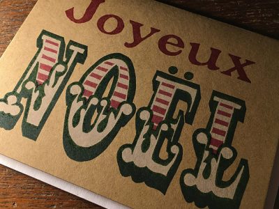
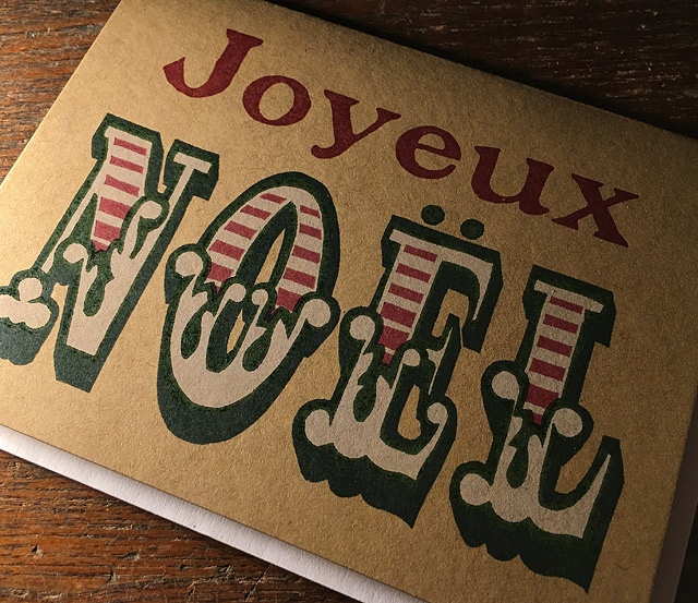
I haven’t had a new holiday card in a couple years, and I just finished this one. The word “NOEL” was based off of a font in a lettering book that belonged to my mother back in her sign-painting days. Inside the front cover, it still has a loose collection of stencils and drawings for names and numbers that she painted on truck doors and bass boats.
The font I chose looks like William Morris designed a typeface for the circus, and I’ve just always wanted to use it somewhere.
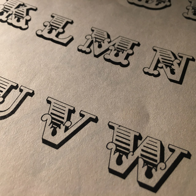
To fill the front of a card, I needed it to be taller and narrower (condensed in type-speak), so I redrew it to the scale I preferred, and made a few changes to balance it better, and make it easier to carve.
I then carved it into three different linoleum blocks to color separate it, and make a multi-colored image. In typography, fonts built of two or more colors are called chromatics.

Finally I printed it on French Paper 100# Brown Box, and added the “Joyeux” in 72 pt. Plymouth, an antique metal typeface I acquired years ago from the Walnut Grove Tribune.
You must be logged in to post a comment.